2020 Angular website rewrite
December 29, 2020

Instead of improving what I already have, I thought it was best to just rewrite the whole thing, with the same look and feel.
Why?
I rewrote this website from AngularJS 1.3.x to Angular 6 more than a year ago in a time when I didn’t know anything about the later versions of Angular. And that was a major shift. Basically AngularJS (v1) is different from Angular (v2 - up), it's like they're different frameworks. I just wanted then to dive right into it and see how I can make it work.
Now that I’ve worked some months with this newer Angular at work, I now see the current implementation of this website as questionable. There are tiny things I did not do right or could do better.
So here I am now, attempting to make it right and hope that 2022 me won’t go back to this and cringe (AKA repeat the cycle).
What changed?
Cleaner Code
Always a must!
Cleaned up a lot of things during this rewrite. I added code linting and code formatter to help me write cleaner code. Still working on getting the rules right with my preference.
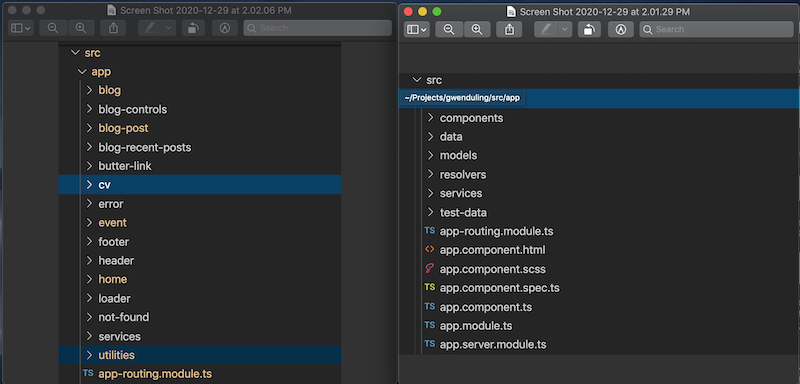
Another improvement I am very proud of is the new folder structure. The old one was just a mess. Also always a (nitpick) problem at work when projects grow bigger. So yey tiny wins 🧹!
old vs new
Using CSS Custom Properties
What is this? It is like having variables in your css code. We already have that feature a long time ago with CSS Preprocessors (LESS, SASS, SCSS) but the difference is using CSS custom properties does not require a compiler or anything to set it up really 😍. The variables are global so there's no need to import a variables.scss file every time. And it can be viewed and changed via developer tools! A major plus points! The only catch is browser support since the feature is new.
Improved UI
At least I think it is better now.
I was working on this for a few weeks now and during this period I already got so sick of the old (current) UI. I was so eager to finish what I started because I know I can't abandon this now that I've seen it. That’s how much I think I made better decisions this time, UI wise.
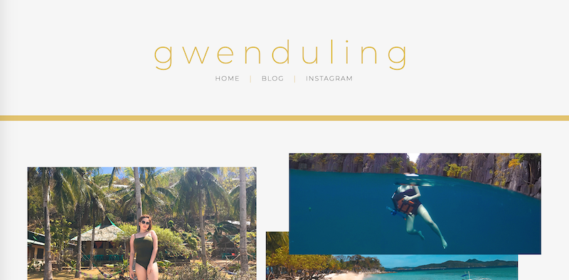
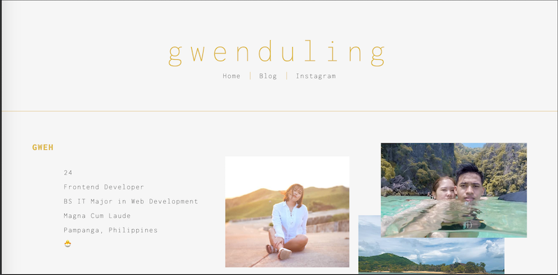
To generalize, I did not change the elements but I made everything thinner and smaller. And it fits the look and feel I am opting for. Most of the change I made were minor but it now seems like these are two very different websites. I think it now shows more attitude and character ✨.
old home page UI
new home page UI
From Monserrat to Inconsolata font
I always loved the Montserrat font. It was always the default for me that it seemed like a boring and safe choice. Okay not boring because it does look good in any design 🤙🏻.
A quick check to Google Fonts later and I have found my new choice, Inconsolata. Font sizes are smaller on the screen and the letters are slightly thinner where Montserrat has chubby ones. It seems like a good fit with the other changes I made.
Blocking content for specific devices and browsers
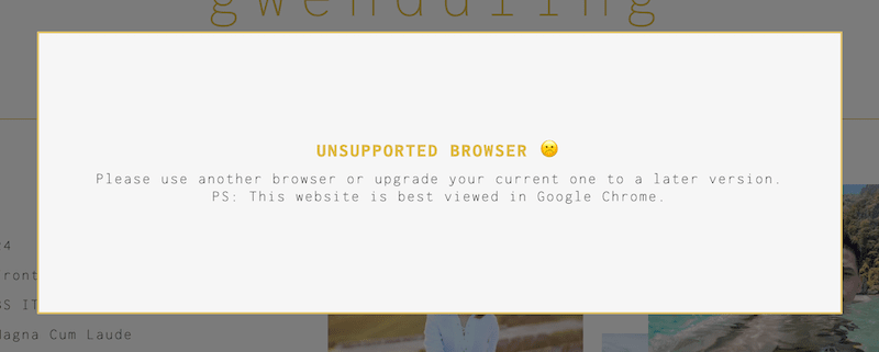
I added popup for users viewing in older browsers. Internet Explorer? We don’t know her 💅🏼.
This is a bit tricky because I'm not as aware on what browsers are being opened when clicked from mobile (social media) so I'm still not sure what browsers to block. But definitely Internet Explorer. I've been using new Javascript and CSS features since the last update and they wouldn't look nice on older browsers that don't support it, might as well not let them see that mess!
Restricted content as well on devices 319px width below because it would be too much work to support those. Just to be sure. (For reference the very slim iPhone 5 has a 320px width).
Improved use of blog engine APIs
The blog engine of butterCMS is so powerful and I know I was not utilizing it enough.
At the end of the day, these kinds of tasks are what I really enjoy working on! Visualizing the power of available data. These are the moments that really feels like there's no limit ⚡️.
Blog Categories
In this recent blog post, I noticed how awkward was this dev related content next to my travel and personal life posts. It did not fit.
I dreaded doing this for a long time because I thought it might complicate my code. WRONG!! It was easy and it went really smooth and it did not break anything (except my brain thinking on how can I design the additional buttons without using any graphic help).
The new thing I am dreading now is the search feature 😇. Next time!
Blog Tags
I now added the tags at the top of the blog posts right below the title. And at the bottom of the page I utilitized these tags again by showing a list of related posts for easy navigation.
Still not so sure with creating a page for the tags similar to the categories. I think the future search feature would be enough. This new improvements already seem massive for me! No need to complicate it some more.
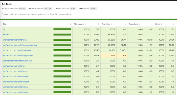
Added unit testing
That last time I wrote a unit test was a year ago in my previous company. We don’t practice these tests now in my current work. And I have seen the difference it would make if we do have it now. I think about this specially when going back again and again on reopened tickets.
I specially appreciate unit testing when improving an already complicated feature. Having a test to ensure that old expectations are still met is a really good benefit. Mostly for me who is new to the project and does not really know the old specifications that were followed.
So as a self proclaimed unit test enthusiast, how come my own simple website does not have it? 🤷🏻♀️
Also, +1 Angular CLI for integrating Jasmine because I still have nightmares the last time (last year) I was in charge of setting up testing in our 3 year old repository. Mocking and preparing components are just too complicated 🤕. Long story short someone else from the team managed to do it using Jest a few days after my failed attempt.
Improved usage of Angular Universal
I wrote a blog post a few months back on how hard it was for me to understand and apply Angular Universal (here and at work). My goal at that time was just to make it work.
So it did work but it has this awkward switch in the UI from using the rendered server content to the client side app. It was annoying because we get this full page with rendered content and back to a loading page when the app is ready because I didn’t care enough then to learn how to properly do a state transfer.
One step at a time right?
Major update as well from prerendering HTML pages to SSR. And For SSR to work, I needed help with the servers so...
Devops automation!
Thanks to my boyfriend who is a devops! As if I needed more reason to justify why AJ is my perfect match, he steps in every part of this that I don’t understand completely.
For the longest time this website is hosted using a free server because servers are expensive and it’s not like I know the difference of a hosting and a server 🤷🏻♀️.
Here’s what AJ added/implemented:
- CI/CD (AWS CodePipeline)
- Dockerized (Docker)
- Reverse Proxy (Nginx)
- TLS/SSL (Let’s Encrypt)
- DNS Service (AWS Route53)
🎉
What’s next?
- Blog search feature
- Pay for a subscription for ButterCMS (currently on free developer mode)
- Add more pages!
- Maybe a shop or a portfolio
- (Adding here to make myself accountable) a Tries page which will serve as my portfolio where I try different design trends (Gradients, Material, Neumorphism).
- Logo
- UI notifications on important days (no time to explain but IN PROGRESS)
PREV
NEXT
loading
loading
Hello, your viewport is too small. ☹️
