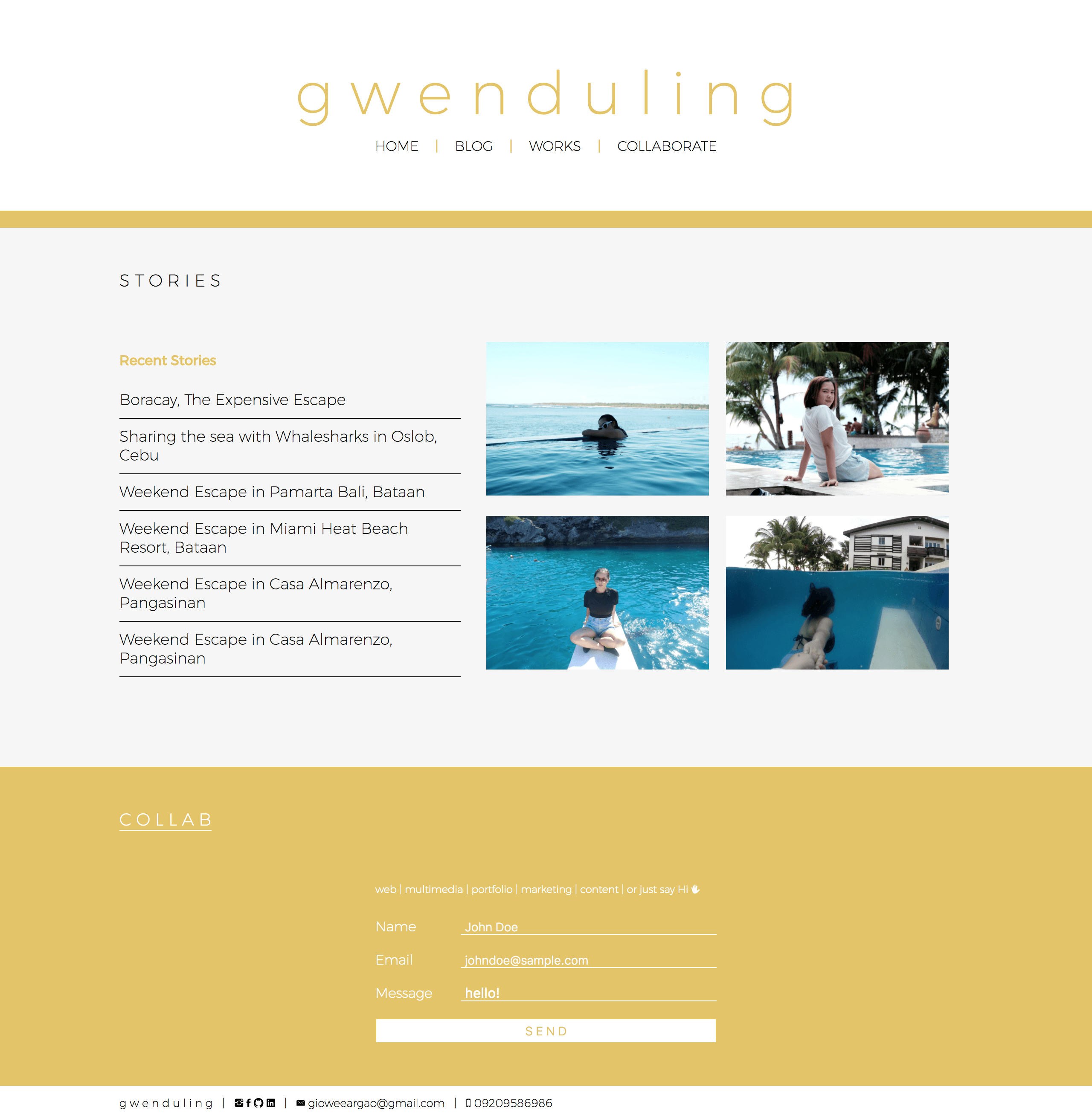
I Finally Finished Redesigning my Portfolio Website
December 25, 2017

I have started working on this when I bought my laptop last June 2016. And it took me a while to finish because
- Procrastination, thanks Netflix
- I changed my mind on the details way too many times
- I can't prioritize it most of the time
- I rewrote everything once I had a working site because the old code is too dirty
I changed my mind on the details way too many times
I have stumbled upon this article a few months back by Rakesh talking about what delayed his portfolio redesign and all I could say is: 'same'
So there's this process that I didn't know I got sucked into.
- I get an idea all by myself or from browsing too many websites during my free time
- I get a feeling that I want it for my website
- I try to create a design prototype in codepen
- I tell myself this is it and continue
- back to step 1
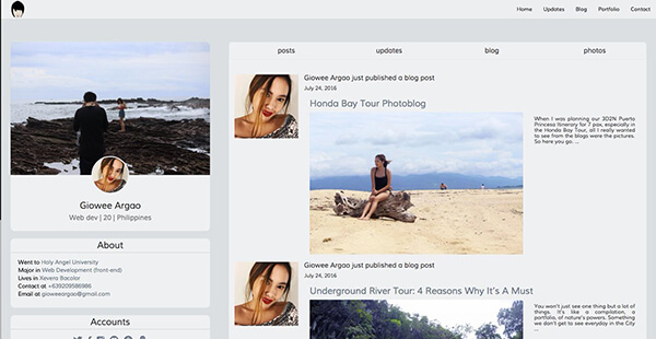
I tried to create a page inspired by twitter
Cons
- too many photos, it would be bad for page speed
- has to be well maintained after development
- approach is a thousand times better in desktop than in mobile
Pros
- I still think it's a good idea (looking for someone I can do this for as an excuse for a rewrite)
I tried one with a black theme
Cons
- just realized I don't like it any more one day
- too common for portfolios
Pros
- professional looking
and a bunch more little ideas in my codepen account.
Here's a little secret: Content First
When I decided I will try again with this website, I didn't know what to do and where to start.
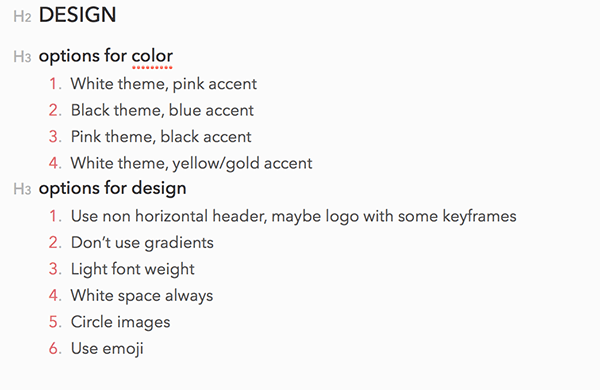
I started by creating a new note using the bear app (AKA best app ever) and wrote there all specific details I want for this website and started coding from there.
Some specifics with the tools I used
"But I don't know how to use WordPress"
Probably my number 1 excuse to procrastinate and here I am a few years later, still inefficient with my WordPress skills.
If you don't know what this is, it is the most powerful (and popular) CMS tool our there that has managed to build a good community too over the years. It's the go to blogging engine.
So instead of spending years trying to go around this just so I can use a design/template and cusomizations of my own, I went with Butter CMS. A much simpler CMS with an API first approach.
Pros
- convenient that I only need to consume an API which also means I don't need much adjustments to achieve what I want
- everything is direct to the point
- I didn't have to use PHP too
- faster development
- free for personal use
Cons
- maybe not a lot of people will be a fan of this simplicity?
Bootstrap who? I don't know her
As a challenge, and proof that I am your frontend girl, I decided not to use Bootstrap. Not that it's bad or anything, I just think that I could sell my work better if I do it from scratch. Not to mention the I should only either use Angular or jQuery rule but Bootstrap only works with jQuery and it is a mess of heavy code to more heavy code on top of each other.
When I had my OJT, I learned that the goal is to make the website look different from bootstrap defaults because there are so many websites that look the same already. And I think that the amount of code it takes to override these defaults are the same if I do it from scratch.
It didn't feel like more work for me.
Mantra: It should represent me
I guess this is what I wanted to portray most of all. I want users to be reminded of me everything they see anything similar to what they see on my website.
Domain name game
When I was still in college we had a class about SEO and we had to create our own blogs so I bought the domain www.giowee.com. It was alright but if you google search 'giowee' the results will be from the phone brand name Gionee and I didn't need that kind of competition in my life.
So when I started working and found a domain sale (they are always on sale btw) on Godaddy, I bought the domain www.gioweeargao.com. I managed to upload my own website with blog using WordPress but it felt like in order to get what I want, it got to a lot of dirty parts. And also I got 24/100 in Google Page Speed thanks to my HD photos. I had let that domain expire too and went on with the excuse that the name is a little too professional (and the fact that it's not my real name)
And that's the boring story of how I decided on www.gwenduling.com
Yellow
I had made an attempt to use the color Pink (my current color obsession) but it just doesn't shout my name when I was experimenting. So yellow it is.
Yellow has been my favorite color for a lot of years. Maybe not so much any more but I can still see how my friends/family know that it's my when they see this color and deciding on using it on my website has been the best decision I ever made.
Direct to the point content. And design.
I used to put everything on my website which was what our college instructor had taught us a few years back. Not following that rule changed my life. I guess if you know me then you also know I don't share everything to the world.
I have seen a lot of portfolio with a lot of animation and color. Transitions here and there. Red here and then there's a blue on the next slide. And I see why they do it. That shouldn't we write the most complicated/extravagant code for ourselves instead of for clients that doesn't really understand a lot about it?
But what I found out most was how the simplest ones are my favorite. Those that doesn't have to prove to you their talent. Those that show the most limited words. They keep me hanging that I sometimes want to contact them and ask for more. I love those (and I'm planning to make a blog post about it too, soon (after I find that one portfolio I really liked but can't search for any more)).
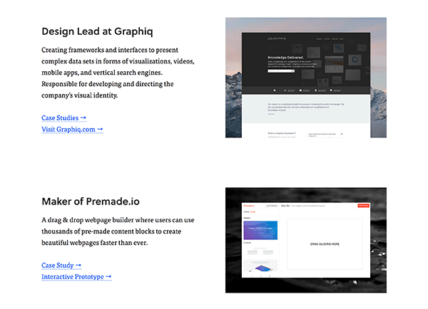
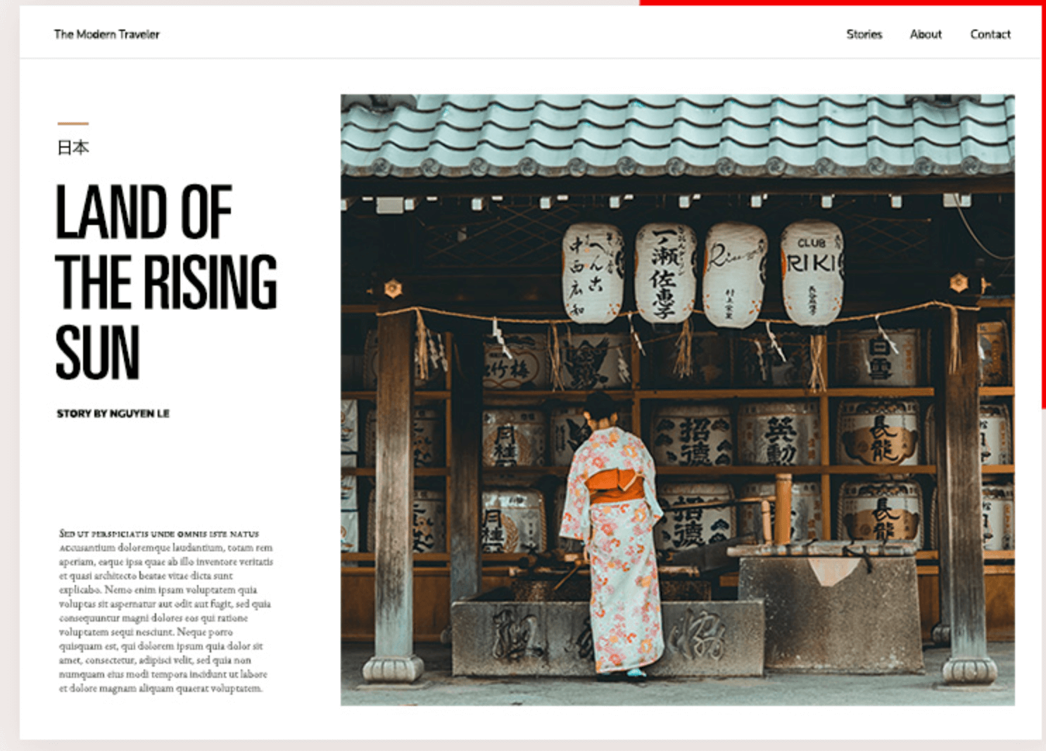
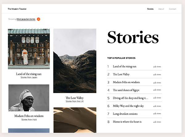
Some inspiration
- Samantha Zhang's website
- Medium
- Aspyn Ovard's blog
- Mindful chrome extension
- other screenshots I can't find the source links any more :(
NEXT
loading
loading
Hello, your viewport is too small. ☹️
